

Two issues identified - jump to either
Both fixes are live in the staging branch staging/hero-responsive-fluid-cc (theme id 160836845826). Side-by-side comparisons below.
sections/rbsv4-sliding-banner.liquid)width: 100% + aspect-ratio: 2000/1073 (image's
native ratio) so the hero fills the viewport AND reserves layout space
while the image decodes (prevents CLS).clamp(2rem, 3.2vw + 0.5rem, 4rem) on the header,
clamp() on preheader and subheader. Text now scales with
viewport between sensible min and max sizes.srcset +
sizes="100vw" on both desktop and mobile images plus matching
imagesrcset on the <link rel="preload">.
Mobile devices now load a 480w/750w/1080w image instead of the 1000w-default
file. Performance win on top of the visual fix.LEFT = LIVE RIGHT = STAGING (the fix)


--- a/sections/rbsv4-sliding-banner.liquid
+++ b/sections/rbsv4-sliding-banner.liquid

# 1. Preload now matches what srcset would have picked
-  <link rel="preload" as="image" href="...width: 2000" fetchpriority="high">
+  <link rel="preload" as="image" href="...width: 1600"
+        imagesrcset="...1000w, ...1400w, ...1800w, ...2400w"
+        imagesizes="100vw" fetchpriority="high">

# 2. Banner sizing
   .rbsv4-sliding-banner-{ID} {
+    width: 100%;
     max-width: 100%;
-    width: min(100vw, 1920px);
-    margin: auto;
+    margin: 0 auto;
   }
   .rbsv4-sliding-banner__image-{ID} {
     width: 100%;
     height: auto;
+    aspect-ratio: 2000 / 1073;
   }

# 3. Fluid typography
-  .preheader  { font-size: 16px; line-height: 24px; letter-spacing: 0.8px; }
+  .preheader  { font-size: clamp(0.75rem, 0.4vw + 0.65rem, 1rem);
+                line-height: 1.5; letter-spacing: 0.05em; }
-  .header     { font-size: 64px; line-height: 72px; }
+  .header     { font-size: clamp(2rem, 3.2vw + 0.5rem, 4rem);
+                line-height: 1.12; }
-  .subheader  { font-size: 20px; line-height: 28px; }
+  .subheader  { font-size: clamp(0.875rem, 0.6vw + 0.7rem, 1.25rem);
+                line-height: 1.45; }

# 4. Image markup with srcset (desktop and mobile both updated)
   <img
-    src="...width: 2000"
+    src="...width: 1600"
+    srcset="...1000w, ...1400w, ...1800w, ...2400w"
+    sizes="100vw"
     loading="eager" fetchpriority="high"
+    decoding="async"
     ...>
Below the hero is a continuously-scrolling marquee of customer review snippets
(JS-driven transform: translateX(), ~80 px/sec). It's a different
pattern from a paginated carousel, and the established guidance from the major
accessibility and UX research bodies is consistent on this:
prefers-reduced-motion is ignored. The
W3C technique C39
explicitly recommends respecting the OS-level reduce-motion preference.
web.dev's primer
and
MDN
both note this is the standard escape hatch for users with vestibular
disorders, migraine sensitivity, and cognitive load triggers - the band
currently animates regardless of that preference.Sources backing the recommendation
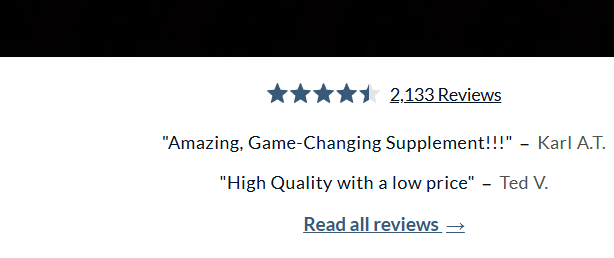
Replace with a static row of review snippets + a clear "Read all reviews"
CTA linking to the existing reviews page (/pages/renue-by-science-reviews,
which renders the full Okendo widget). The Okendo aggregate (4.5 stars, 2,133
reviews) is also wrapped in a link to the same page so users have two affordances
to get to the full reviews. Responsive: 4 reviews on wide desktop, 3 around
1100-1400 px, 2 stacked on mobile. JS marquee file is deleted.
LEFT = LIVE (marquee, mid-frame) RIGHT = STAGING (static row)


--- a/sections/home-page-reviews-banner-section.liquid
+++ b/sections/home-page-reviews-banner-section.liquid

# Markup change: marquee container -> static row
-<div class="...slider-container">
-  <div class="...customer-review-items"> ... 5 hardcoded reviews ... </div>
-</div>
+<a href="/pages/renue-by-science-reviews" aria-label="Read all customer reviews">
+  {% render 'okendo-star-reviews' %}     {# rating becomes a link too #}
+</a>
+<div class="...static-row">
+  <div class="...customer-review-items"> ... 4 reviews, no JS ... </div>
+  <a href="/pages/renue-by-science-reviews" class="...read-all-link">
+    Read all reviews ->
+  </a>
+</div>

# CSS: kill the cap (same bug as the hero), responsive hide-by-nth-child
-.home-page-reviews-banner-section { width: min(100vw, 1920px); margin: auto; }
+.home-page-reviews-banner-section { width: 100%; margin: 0 auto; }
+@media (max-width: 1400px) { .review-item:nth-child(n+4) { display:none } }
+@media (max-width: 1100px) { .review-item:nth-child(n+3) { display:none } }

# JS: marquee animation file deleted (37 lines gone)
| Repo | RenueByScienceOrg/RenueByScienceUS |
|---|---|
| Branch | staging/hero-responsive-fluid-cc |
| Connected theme | RenueByScienceUS/staging/hero-responsive-fluid-cc (id 160836845826) |
| Reviews page | /pages/renue-by-science-reviews (already exists, renders the full Okendo widget) |
| PR (when ready) | github.com/RenueByScienceOrg/RenueByScienceUS/pull/new/staging/hero-responsive-fluid-cc |